New Digital project: interactive video

I made a standalone interactive video webapp with AngularJS and Videogular.

A Live demo is now available, with a temporary video (a mute version of the Ghost House video) and random scenes. The creative side still needs to be done, I need to find an appropriate concept to use this code with: probably a journey into someone’s mind as they take decisions, or a maze of some sort.

If you’re into that sort of things 😉 you can find the code on bitbucket and a brief technical explanation here: I overlayed a UI layer made with Angular views and router on top of a HTML5 video powered by Videogular. The UI layer controller retrieves the scene structure (with start and stop timings) from a JSON file via a custom service and displays custom UI for each scene offering the user to go to various other scenes. When the user clicks on a UI element, the router goes to another scene and the UI controller dispatches an event saying the scene has changed. The video controller catches the event, plays the video sequence associated to the new scene, and dispatch an event at the end of the sequence.

This project has its own page under ‘Digital Media’ where updates will (very slowly) be posted.

Creative briefs, the concept of insight and idea generating.

In October 2011, I was selected to participate in Onedotzero Cascade graduate workshop, where I had the opportunity to attend seminars by Digital Media industry experts and work on a group project responding to a creative brief. As someone trying to move into the Digital Media industry, the main benefit of the workshop was this in-depth training into how to interpret and respond to a brief, the concept of insight and methods of idea generating.

When working as software engineer, I had the opportunity to work on one creative coding project (mathematically generated seascape) where I did both the design and implementation parts and where the design process and workflow was very similar to what takes place in the Digital Media industry. But for most traditional software engineering projects, such a thought process is not required because all user requirements and experience considerations are sorted by Marketing, who then give strict implementation guidelines for the engineer to follow. I was once given the opportunity to take part in the process from the other side and do a marketing research project about ways to prevent hearing loss from personal stereo devices. I had to take into account technical considerations, such as which algorithms were suitable complexity-wise for the chips used by my employer and which algorithms may be adapted to reuse calculations already done by the existing audio system, but also considerations of user experience and psychology: which devices were simple and unobtrusive enough for users to actually bother using them? How to present the hearing protection solution in way that is not patronising or authoritarian, so that the user does not develop an emotional rejection? Research showed that while people tended to react badly to being told to ‘turn the volume down!’, they were more receptive if focus was put on the positive rather than the negative. For example by saying: ‘People usually turn the volume up to compensate for poor intelligibility. Our product gives a better sound quality so you don’t need to turn it as loud to understand everything’ rather than ‘You are damaging your hearing by listening to music too loud’. Presenting the device as providing something extra rather than limiting the user’s behaviour. However these projects were an exception rather than the traditional way of working in software engineering.

As an artist, I was of course very familiar with creative thinking and idea generating but a fine artist defines their own brief. They do not need to understand a third party’s needs, nor to interpret and decode their phrasing of it.
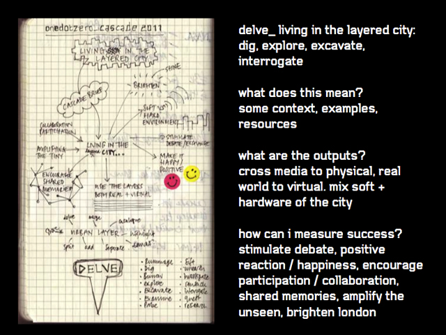
onedotzero cascade brief

The brief we were given was ‘delve living in the layered city: dig, explore, excavate,
interrogate’ with indications to ‘stimulate debate, positive reaction / happiness, encourage participation / collaboration, shared memories, amplify the unseen, brighten London, interrogate’ and to ‘zoom in, explore below the surface’. The brief suggested various potential angles of interpretation and avenues of exploration, including architecture, advertising and the subversion of it, street art, the collecting of data on the population and its movements. The ones that caught my interest most were ‘look at the everyday as extra ordinary’, and the keywords of ‘layers’ and ‘shared memories’.

An industry expert from advertising agency Mother insisted on the importance of cultural reference points in generating ideas that are relevant and likely to make an impact on an audience. He called this concept ‘insight’, which is coming up with modern, unusual or never thought before take/viewpoint/interpretation on an idea, problem or question.

The word ‘layers’ immediately suggested to me the idea of layers of subjective experience of the city. A city in itself is nothing but a collection of buildings and infrastructures. What makes it vibrant, lively, unique is the experience of the people living in it at any given time, their unique individual vision, their subjective viewpoint and values, the emotional relationship they have with their habitat, be it a sense of home or belonging, a wish to escape, or the desire the change or reinvent the place. I remembered groups of people both online and offline exchanging information about landmarks in London connected to alternative music. I remembered travelling abroad and obsessively looking for landmarks in cities connected to artists or writers whose work I admired. Such information cannot always be found in mainstream tourist guides. Mainstream guides indeed appeal to ‘cultural reference points’, to borrow Mother’s words, but they do so by referring to the lowest common denominator of culture. On top of mainstream culture, the most vibrant and cutting-edge cities, including London, have a myriad of subcultures that cohabit on top or beside each others, like so many layers of semi transparent fabric. Sometimes, two or more of these niche cultures meet, clash and merge to form something new, creating a new shade of colour in the complex fabric of the city.

With this basic idea in mind, I did some research to determine whether my insight had the potential to have some cultural resonance with other people. When researching online, I found the website Exploring 20th Century London, a partnership project between 14 museums in London, including the Museum of London, the London Transport Museum and the Jewish Museum. The project’s aim is to ‘link the objects in the collections with the broader history of London’ and ensure that ‘all objects and images featured on the site speak of the real events and experiences of twentieth-century London’. Two topics covered by the project are ‘Youth Culture and fashion’ and ‘Communities’.

About Youth Culture and fashion, the project explains:
‘During the 20th century London’s position as the place where fashions were set remained the same but the pacemakers changed. Fashions were now led by the young [as opposed to the aristocracy before]. From the bright young things of the 1920s dancing the Charleston to hot jazz; through to the punks of the 1970s pogo-ing to The Damned, the young assumed a new cultural importance in 20th century London.’
The website then proceeds to list various youth cultures through the twentieth-century, relating them to landmark places when relevant, and explain in what measure their influence slowly sipped into the mainstream culture of London.

About Communities, the project says:
‘the sheer size of London’s population has always encouraged the growth of smaller communities within it.  Shared experiences bring people together and during the 20th century  shared experiences came to include ethnic background and sexuality, as well as religion, neighbourhood and class. London ended the 20th century  with a myriad of overlapping communities, each bound together by a sense of people having something in common and a distinct identity.’

So a collaborative project between several London museum believed that the shared experience of overlapping communities of people bound together by a feeling of common identity, either born into (‘communities’) or acquired by cultural choice (‘youth culture’), was a key angle to understand 20th century London. It seemed my insight had cultural resonance after all.

Based on this, I suggested the idea of a ‘subcultural map of London’, an interactive map where the public would be invited to submit landmarks related to various cultures, along with personal memories of events associated with them. People could have shared the story of their first punk concert in an obscure pub, memories of a protest they took part in decades ago, told of a temple where their grandmother took them, or described an art happening they saw in the 60s of which all physical traces have disappeared. I suggested the project could be submitted to the group of museums who might express interest in it.

After group discussion where all my team mates submitted their own insights, the consensus evolved into the idea of unlocking the stories or people living in London or passing through the city. To create a platform where these snapshots of ‘everyday magic’ (to borrow the words of the Surrealists) could be captured and made public to stimulate the viewer’s imagination. People would be invited to upload multimedia content (pictures, video clips, sounds, text) about random things they witnessed on the street, and this content would then be put together to be displayed to viewers on the platform, forming a semi-random narrative. The main challenge posed by this idea was to figure out how to put together disparate multimedia content submitted by various people into a coherent presentation, offering both a compelling narrative and aesthetic appeal. To try and solve this technical challenge, I did some research into Lev Manovich’s database cinema, which constructs dynamic narratives from multimedia elements based on keywords submitted by the audience (these research findings are summarised in another blog post). I thought the concept was promising as it would allow people to get a personalised visual narrative of London tailored to their interests.

The process of coming up with an insight into an issue, collating it with the insights of my colleagues and reaching a consensus on a group project was a very enriching experience.
Background Research on Lev Manovich’s Soft Cinema

At the end of my MA, one of the avenues I wanted to explore for further work was to use algorithm to relinquish control on the editing of a piece of video art.

Last month I took part in onedotzero cascade and my team decided to explore narrative in a visual way (I’ll blog more about cascade and this project in a subsequent post). Because Lev Manovich’s Soft Cinema was relevant to our project, I did a bit of background research on it to present to my team.

http://en.wikipedia.org/wiki/Database_cinema

Manovich opposes narative and database in his theoretical writings. However, he cites Peter Greenaway as an example of database cinema (soft cinema). Yet, Greenaway does not do away with narrative, rather he experiments with non-linear forms of narrative, in the tradition of modernist literature.

http://www.softcinema.net/?reload

Soft Cinema as a software edits movies in real time by selecting multimedia elements from a database based on rules defined by the authors.

http://www.softcinema.net/form.htm

SOFT CINEMA explores 4 ideas:

1. “Algorithmic Cinema.”
Using a script and a system of rules defined by the authors, the software controls the screen layout, the number of windows and their content. The authors can choose to exercise minimal control leaving most choices to the software; alternatively they can specify exactly what the viewer will see in a particular moment in time. Regardless, since the actual editing is performed in real time by the program, the movies can run infinitely without ever exactly repeating the same edits.

2. “Macro-cinema.” If a computer user employs windows of different proportions and sizes, why not adopt the similar aesthetics for cinema?

3. “Multimedia cinema.” In Soft Cinema, video is used as only one type of representation among others: 2D animation, motion graphics, 3D scenes, diagrams, maps, etc.

4. “Database Cinema.” The media elements are selected from a large database to construct a potentially unlimited number of different narrative films, or different versions of the same film. We also approach database as a new representational form in its own right. Accordingly, we investigate different ways to visualise Soft Cinema databases.

I’m not too interested in ‘2 – Macros cinema’ because I like the traditional aesthetics of one frame.

I’m interested in ‘3 – multimedia cinema’ because it offers the possibility to mix video clips with sound and/or music from a different source, or superimpose a still image on a video, but not in the way Manovich does it: ‘While some music videos and artist videos already mix some of these different types of imagery in one work, Soft Cinema assigns each type of imagery to a separate window in order to dramatize the new status of “normal” video, photographic and film image today – no longer the dominant but just one source of visual information about reality among many others.’ Apparently, Soft cinema keeps the different media in separate windows, therefore not creating a real multimedia final product. I would rather find a way to mix the contents together like it is done in some video clips.

What I’m really interested in is ‘1 – algorithmic cinema’ (4 – database cinema cannot in my opinion really be considered as a separate concept, because the database is only the collection of multimedia raw material the algorithm will choose from. The database itself does nothing but hold a collection of content.)

The Soft cinema website explains how ‘algorithmic editing of media materials’ works:
‘Each video clip used in Soft Cinema is assigned certain keywords that describe both the “content” of a clip (geographical location, presence of people in the scene, etc.), and to its “formal” properties (i.e., dominant color, dominant line orientation, contrast, camera movement). Some of the keywords are automatically generated by an image-processing software (written in VideoScript), while others are input by hand. The program (written in LINGO) assembles the video track by selecting clips one after another using a system of rules (i.e. an algorithm). Different systems of rules are possible. For instance, one system selects clips closest in color, or type of motion to a previous one; another matches the previous clip in content and partially in color, replacing only every other clip to create a kind of parallel montage sequence, and on and on.

The current version of Soft Cinema software allows the author to define such a particular system of rules, which it then uses to compile a sequence of video clips that best satisfy these rules. However, it is also possible to create other versions of the software that would give the author tighter control over the sequencing. For instance, one version may involve a video track completely edited by the author beforehand. Some shots could be designated as “replaceable” while others would remain unmodified (to keep narrative continuity.) Another version may contain a variable set by the author, which tells the program the probability of any shot being replaced. In summary, instead of posing complete randomness against the complete control of a human author, Soft Cinema investigates a different paradigm: using a computer as an “association machine” that complements / reacts to images selected by the user with other images.’

Round up of other MA Digital Art/Media degree shows

I’ve done a round up of degree shows of MA courses similar to ours, and tried to find reviews that could help us know recurring weaknesses to avoid when putting up our own show, or on the other hand things that the critics appreciate.

Brighton University Digital Media Arts MA:

http://www.resonancearts.co.uk/

A review, but it’s not very helpful regarding the strong/weak point of the show, it just sort of sums up the type of artwork.

Norwich University College of the Arts MA Digital Arts:

http://www.nuca.ac.uk/ma-degree-show/show-gallery/view/58

Two students whose work I liked:

Ligita Barauskaite

Jane Vance

There is a MA Digital Media Development at Winchester University, but this course seems much more industry and less Fine Art oriented than ours, plus the pdf of their show only lists works from Ba/Bsc students, even though the MA students are supposed to show with them.

Interactive media MA at Goldsmiths College: Show site.

A review with a quote that gets you thinking:

‘The course combines teaching critical theory with practical programming skills. At the show, Disconnect and Punish, I was struck by what appeared to be a great division in the way the students showed their work. The show seemed completely split between what was presented as art and the work which was presented essentially as interpreted data on a computer screen.’

I’m pretty sure there used to be a MA Digital Art and Technology at Plymouth but it seems to have turned into a MRes.

So it seems that Brighton and Norwich have MA courses pitched similarly as ours, at the crossroads of Fine Art and Technology. The feel I get from the way the shows at Winchester and Goldsmith are presented is that they are much more ‘pure technology/industry oriented’ type of courses.

Also I found places to advertise our degree show:

http://www.creativereview.co.uk/cr-blog/2011/june/graduate-shows-list-2011

Contextualising my practice within digital moving image

In Digital Art, Christiane Paul writes about a type of Digital Art that uses Digital technologies as a tool, without necessarily ‘reflecting on those technologies’ aesthetics [nor] making a statement about them’.

Among the works of this types, Craig Kalpakjian’s digital video Corridor (1997) follows a computer generated seemingly endless hallway that causes in the viewer feelings emptiness and alienation by way of its cold formal perfection.

She makes a difference with Digital Art using digital technologies as a medium. She says that such art ‘exclusively uses the digital platform from production to presentation’ and ‘exhibits and explores that platform’s inherent possibilities’. In consequence, such art is ‘interactive, participatory, dynamic, and customizable’ but it ‘has multiple manifestations and is extremely hybrid’ and its theme is not necessarily technology-related. She classifies interactive installations within this category of art, and I feel this is the direction I could take to use more cutting edge technologies within my work. I am particularly interested in installation that use digital technology to go beyond traditional video installation by enhancing the feeling of immersion, or by making them react to the viewer. Christiane Paul extends her survey of such art in her essay ‘Expanding cinema: the moving image in Digital Art’, published in ‘Film and video art’ by Tate publishing.

Some immersive video installations experiment with the spatialisation of moving image in a physical environment, for example Michael Naimark’s Be Here Now (1995) and Jeffrey Shaw’s Place, a user manual (1995). Both works are descriptive and documentary like, but I would like to use spatialisation together with the next type of work which explores narrative.

Other video works explore the possibility of ‘abandoning control over an image sequence’ (in Grahame Weinbren’s words), constructing a digital cinema based on interactive visual narratives.

One of the earliest interactive narrative films is Lynn Hershman’s Lorna (1979-84) made for television. The viewer navigates the narrative with a remote control. The minimal control technology is similar to a favourite piece of mine, Markus Schinwald’s Dictio Pii, where the viewer switches between characters’ point of views using a remote control. Lorna tells the story of a woman who lives a completely isolated life in her appartment, her TV being her only interaction with the outside world. The disruption in the non-linear narrative caused by the viewer’s using the remote mirror Lorna’s unstable psychological state. The story has three possible endings: escape from the apartment, suicide or the end of mediation by shooting the television.

Weinbren’s own work Sonata (1991-3) blends two classical works, allowing the viewer to modify the steam of the narrative. The 2 story lines share the themes of seduction and murder: the Biblical story of Judith who pretended to seduce and decapitated the general Holofernes, and Tolstoy’s The Kreuzer Sonata in which a man’s suspicion that his wife has an affair with a violinist leads him to kill her.

weinbren - sonata (still from)

Toni Dove made a trilogy of digital video installations that address the unconscious of consumer economies.

In Artificial Changelings (1998) (on Toni doves’s website and on , the viewer controls the narrative by stepping into four sensor-controlled zones on the floor. Zone 1 steps into a character’s mind, Zone 2 prompts a character to address the viewer directly and Zone 3 induces a trance or dream state. The last zone causes the story to travel into the past.

still from toni Dove's Artificial Changelings

Spectropia (1999-2002) uses the metaphor of time travel and supernatural possession to connect two narratives, one taking place in the future and the other in 1931. The interface employs sensors, speech recognition and vocal triggers in order to enable viewers to navigate the spaces, speak to characters and have them respond, move a characters’s body and alter or create a sound.

[youtube http://www.youtube.com/watch?v=mNOaYbNQNV8&w=425&h=349]

I found those works very interesting and relevant to my practice because they explore dark psychological themes. It’s almost as though they use the possibility of random choices afforded by digital technologies to simulate the often erratic and irrational way human beings make decisions and choices.

I might look for further information on the subject in a book she recommends: Expanded Cinema (1970) by Gene Youngblood.

I found Christiane Paul’s book an interesting read because it helped me contextualise my own practice within digital art, while I often feel I share little concern with the more technology-centric hardcore digital art. It gave me ideas about how I could use more cutting edge technology within my practice while still keeping my non-technology minded themes.

Decode – Digital Design Sensations at V&A

I went to see the exhibition Decode – Digital Design Sensations at V&A. Various new media works were presented under 3 themes: code, network, interactivity.

The Code part presented mostly moving graphics generated by various algorithms: complex and certainly difficult to code but not visually spectacular. I would say the visitor would be more inclined to admire the amount of work put into it than the visual result itself. I would suppose that, for a visitor lacking the technical knowledge to evaluate the difficulty of the coding, the displayed works might have fallen a bit flat. A piece I did like in the code section (that had an interactive element to it) was a screen displaying graphics that changed depending on the sounds picked up by a microphone (Solar by flight404). I had good fun singing into it and clapping objects together to see how it would react to various pitches and impulsive sounds, and, from the crowd around the display, other visitors had fun being noisy too ! However fun it was, it was not very new though: it was exactly like the graphics from windows media player. I am not sure how much more difficult the real time factor would make it than the windows media version: I would think that the software transformed the sound into the frequency domain to extract meaningful parameters that controlled the visual. The microphone in the V&A version would pick up raw samples in the time domain that could be directly converted in the frequency domain. The job would be similar in difficulty if windows media was reading a CD, but if it was reading a mp3 or other compressed audio file, it would have to extract the raw samples first, so one more task to do. However windows media may not generate the visuals in real time as the music is being played: it may generate them in advance (since it has access to all the audio data in advance) when the PC has spare memory, and use those visuals generated in advance when the processor is busy. If windows media does not generate the visuals on the fly, then the V&A version would indeed be more difficult to code since it would have to be very optimised in order never to run out of memory.

The Network section mostly showed graphical displays of data mined from the internet. I failed to be really grabbed by anything in this section since I had no particular interest in any of the mined data, and the visual representations were rather functional, so not very enjoyable as a purely abstract visual experience. “Digital Zoetrope” by Troika was randomly displaying keywords mined from the Internet relating to “the experience of life in London” and I did look at the words refreshing themselves for a while, maybe expecting something vaguely psychogeographical to come up. But all that came up were names of places and even the name of an estate agent, so I got bored with it since I felt the artwork was staying on the routine surface of daily life and not really revealing me anything that had not been flooding the “money” of “lifestyle” pages of any paper for the last 10 years. It is possible, however, that more patience would have been rewarded by deeper meaning appearing on the screen.

The Interactivity section presented, guess what , artworks with an element of interactivity !

“Dandelion” by YOKE and SENNEP was beautiful, technologically impressive and highly entertaining. Blow away the petals of a dandelion using a fake hairdryer containing remote command ! I was impressed by the precision with which subtle change of movements influenced the trajectories of the petals.

Dandelion by YOKE and SENNEP

On a similar idea, Simon Heijdens’ “Tree” sheds leaves, supposedly reacting to the actual wind outside the museum (monitored by sensors). I liked the idea of linking the dark, muffled, highly controlled space of the gallery to the randomness and unpredictability of the natural world outside. Perhaps a comment on the use of technology for control and surveillance, yet, despite all our advances, we are still mostly powerless when the natural world really shows its full power. However, I was less impressed with the “fallen leaves” on the gallery floor which were supposed to react to the visitors’ walking in them. I walked through them at different speed, jumped through them and they did not react. I did see them move randomly where nobody was walking though.

Tree by simon Heijdens

“Oasis” by Everware is a large screen put flat on a table and covered in black sand. Strange Sea Creatures move about around the screen, breed, multiply and form colonies, responding to the way the visitors move the sand around on top of the screen. I experimented with moving the sand in different ways around and on top of existing creatures colonies and could not quite decode their behaviour. However, that was not a disappointing experience like the leaves failing to move when I jumped in them but rather un puzzling and fascinating experience. As I understand the artwork, it was not a game of “frighten the goldfish and see them scatter away” but rather the idea of disrupting the creatures’ environment to influence their evolution as a group: the creatures were supposed to try and settle in the areas not obstructed by the sand (sunlit and thus fertile ?) Because of this evolutionary subtext, I would assume the creatures responded in a subtle way to the shuffling of the sand on the long term. The one reserve I have about the concept is that I’m not sure the artwork was designed to cope with lots of people shuffling the sand twice every second ! Such quick dramatic changes in the environment do not make sense on an evolutionary perspective. I wonder if the designers/artists foresaw that and dealt with it, or whether the visitors’ constant shuffling of the sand upset the algorithm and the creatures ended up behaving in a completely random way in consequence. But in any case, I was fascinated by the experience of trying to understand the logic of another life form that had no direct way of communicating with me.

Oasis by Everware

“Venetian Mirror” by Fabrica is a large screen on which the image of the visitors slowly appear if they stay long enough in front of it. The longer you stay, the more distinct your image. Once you move away, your image slowly disintegrates. It looked exactly like a digital, interactive version of very long exposure photography. Seeing a still, ghostly double of myself slowly appearing on screen was uncanny, especially since my Doppelganger’s face was blurred in featureless dark shadows, like a Francis Bacon portrait. (I think that was a side effect of the low lighting in the gallery since other people standing in another direction appeared white). Still, fascinating and creepy !

Venetian Mirror by Fabrica

An interview with Golan Levin in the exhibition booklet attracted my attention. He says: “Previous art forms such as film, video, animation, sculpture and even painting have slowly incorporated the computer as an essential tool. It is – almost – no longer meaningful to refer to oneself as a computer artist; we are all computer artists now. The artists in this exhibitions at the V&A are perhaps in the last generation of people who could call ourselves this, before the term becomes meaningless. Our works are concerned, very specifically, with the social implications of computing technologies (technoculturalism) and the aesthetic potential of generative software (technoformalism). Soon, hopefully, we will all just be “artists” again.”

As digital technologies become ubiquitous both as practical tools in daily life and within art making, will the technologies in themselves soon stop to captivate the attention of artists? Will they soon go as unnotified as a pot of paint or a guitar lying about in someone’s studio? Will the attention of the artists shift back to this other part of the experience of being human that is mainly unaffected by the era in which we end up born and its specific technological progress? I think I already saw subtle traces of this evolution in the last 3 artworks I commented: “Tree”, “Oasis” and “Venetian Mirror”. They were using technology not to talk about technology but simply about life.