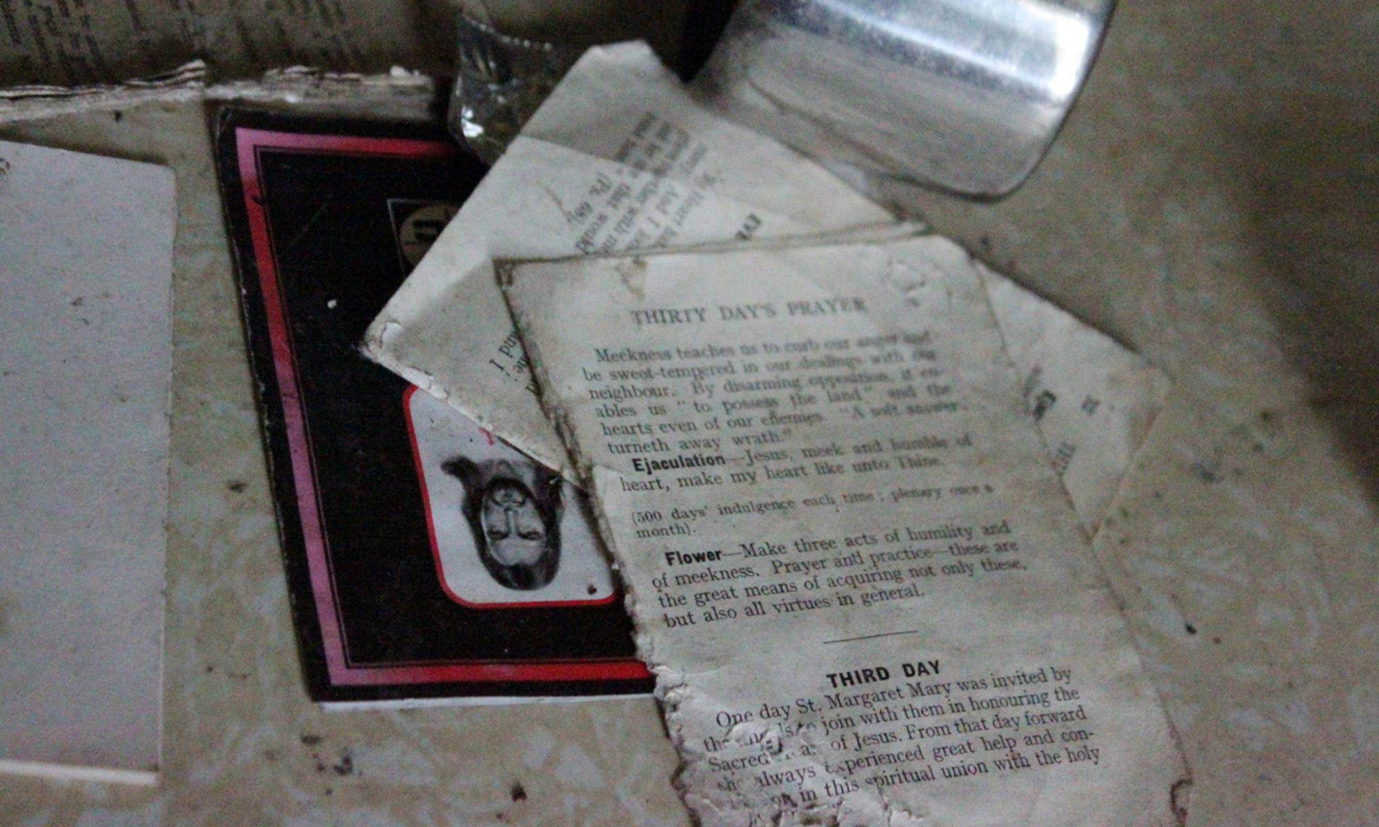
I have made a new version of ‘Ghost House’, using footage shot in 2009 already used in the 2010 edit, and new, previously unused footage shot in 2010.
[youtube http://www.youtube.com/watch?v=gzmnxv6_CAo&w=425&h=349]
I needed to make a 5 minutes version for a submission that required a 5 minute film and found it a worthy exercise. The limited running time forced me to very carefully consider the appropriate length to get the most efficient effect from every single shot. I realised that in the previous version, I sometimes tended to let static shots run for as long as they were beautiful to watch. I realised that in trying to use as much of my footage as I could, I ended up diminishing the efficiency of the shot because, however beautiful the static shot, the audience was getting bored with it before it disappeared from screen. I saw that I could get more striking results by being more ruthless in my cutting, by keeping shots to the minimum length required to get affected by their atmosphere, but short enough not to get bored with it, even if it meant discarding well shot footage. I also took the difficult decision to discard beautiful shots because they did not quite suit the mood of the piece, whereas last year, I always tried to edit in everything pretty.
Reading all those reference cinematography and editing books, and writing down the tutorial helped me realise the paramount importance of coherent mood and precise rhythm. It’s more important to have a piece where the mood is coherent and not disturbed by elements that don’t quite fit, and a rhythm very precisely designed to lull the viewer into the desired reaction that to try and use as much of my good footage as I can just to prove I can shoot good images. Reading those reference books also made me more aware of how easily a viewer may be ‘jerked out’ of the world of the film by bad editing transition or jerky shots. It’s not about aesthetics, it’s about maintaining the illusion.
I feel my technique improved by following those abstract concepts, but ironically, I ended up breaking several textbook rules on purpose. You are supposed to start and end each sequence on a static shot, but I found out I got better results by ending and starting most moving shots on movements, but making sure that there is a continuity in the speed of fluidity of the movement in the 2 thematically different shots each side of the cut. Part of this is due that if I zoom in or out with the camera fixed on a tripod, there is often a slight jerk when I press the zoom button. It’s very slight but noticeable because the camera does not otherwise move. Ironically, it was more natural to start and end slightly jerky hand held shots on a freeze frame, because the slight sway was present all through the sequence and therefore not shocking. The other reason In think this particular rule was not appropriate is that it is designed for traditional narrative cinema where the camera is fixed and the actors move within the frame. Whereas I film static building and the movement comes solely from the camera move. Therefore what matters is to keep the movement of the camera fluid and regular, to give the impression it is travelling through the house without interruption. It’s as though the camera is the only character, the unseen narrator’s eye, and what must be preserved is the coherency of its point of view. Therefore, I aimed to keep a very fluid rhythm all through the piece, to give a sense of geographical continuity even though the video was shot at three different houses, to give the impression that a ghost was moving through the house, no longer limited by laws of physics and Euclidean geometry, and that we were seeing the world through its eyes.
It reminded me of a comment in The Technics of Film Editing by Reisz & Millar about Alain Resnais using moving camera shots in Last Year in Marienbad for the sheer sensual pleasure they procure. And indeed, in Marienbad, the camera moves a lot through the endless corridors while the actors in them are frozen like statues, almost becoming part of the décor, as immobile as the discarded objects of my ghost houses. I think the words ‘sheer sensual pleasure’ struck me, because I had never considered my relation to the moving image medium that way, yet I realised it was very true.
By the way, thank you WordPress for finally allowing to embed youtube videos!! 🙂

Good video. I liked how the camera took me on a journey into the house.
Thanks Bill! You saw you’re thanked at the end 😉