Symposium: comments on my pecha-kucha presentation

Below are comments from my classmates about my pecha-kucha presentation for the symposium, and any answers I may have to them.

Jonathan Kearney (jkearney)

7:44

Melanie next

her stuff is on her blog and we will read it our from here

7:44

Maya Chami (mayachami)

7:45

ok

Jonathan Kearney (jkearney)

7:45

so Ed read that I hope you could hear

7:54

Maya Chami (mayachami)

7:55

not much, just read from the blog

Jonathan Kearney (jkearney)

7:56

very clear from Melanie

we will move on now

I did not get much comments because, as an experiment, the symposium was held via an audiolink instead of our usual typed IM chat. I could not participate in the audio chat from my workplace and therefore missed any comments the face to face students said. A lecturer read out my blog presentation to them, but, as the comments from the other onliners show, the sound link was not very clear to the other onliners even if they could participate in the audio chat.

‘pecha kucha’ 6min40 sec presentation for group tutorial

For the ‘Pecha kucha’ group tutorial presentation, I’m going to put 20 still images with a short sentence of text that would not take me more than 20 seconds to say verbally should I have the possibility to present in person via powerpoint. I just find this is a clearer and more straightforward way to present than to use video to display 20 still frames, with either a voice over (with my French accent on youtube quality) or subtitles that would either be superimposed on the image and obscure it or rolled down at the bottom at the speed that may not be comfortable for all viewers.

***

1) My project explores the subjective perception of space via the media of photography and video. My research led me to study very different influences.

http://farm6.static.flickr.com/5013/5403081356_54c2921f6e_b.jpg

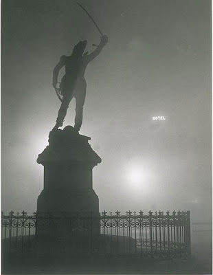
2) The Surrealists used photography to hunt for the ‘everyday marvellous’ in the city. They believed that nothing was stranger than reality.

http://bp3.blogger.com/_z_n7fymGwiI/Riv17o-Qk5I/AAAAAAAAAMI/NMeGLOdI0BQ/s400/EXP-BRASSAI1899984.jpg

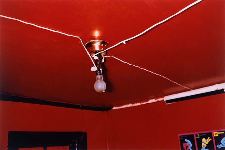
3) A long tradition of American photographers do ‘subjective documentary’, that is, documentary photography that tells more about the photographer’s mindset than the subject. They often photograph backward rural areas or urban decay.

http://static.guim.co.uk/sys-images/Guardian/Pix/pictures/2010/10/1/1285951722872/Red-Ceiling-Greenwood-Mis-004.jpg

4) I’m especially influenced by Robert Polidori who photographs ‘interiors as metaphors for state of being’. He started with abandoned buildings like me, then branched out to interiors that mirror a country’s view of itself, such as Versailles or Cuban mansions.

http://www.artinfo.com/media/image/11081/002_Polidori_2520Deslondes.jpg

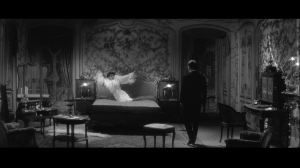
5) My research paper explored how all the technical elements of moving image such as light, editing and sound can work together to represent on screen the inner world of a character. I looked at three films: ‘Lost Highway’ by David Lynch, ‘Stalker’ by Andrei Tarkovsky and ‘Last Year in Marienbad’ by Alain Resnais.

http://melaniemenardarts.files.wordpress.com/2011/05/c2a9alainresnaislastyearatmarienbad.png?w=300

6) Outside of mainstream cinema, experimental film-makers take this visual exploration of the human psyche to extremes. The Ukrainian film ‘Las Meninas’ tells the story of the dysfunctional family and the claustrophobic atmosphere of the house and unnerving sound design mirror the characters’ neuroses.

http://m1.ikiwq.com/img/xl/8aqRTbxau7q3dLAQKhMfub.jpg

7) Video artist Markus Schinwald shows strange, stoic looking characters wandering aimlessly though a drab, dark hotel. The characters perform odd, seemingly pointless actions and seem utterly lost in the labyrinth of the hotel. The video gives a strong feeling of alienation.

http://put.edidomus.it/domus/binaries/imagedata/Dictio%20pii%2004_Big.jpg

8 ) In ‘Talo’ (The House), Eija-Liisa Ahtila shows a woman suffering from psychosis wandering inside her house. The visuals and sound design reproduce the altered spatio-temporal perception and auditory hallucinations experienced by psychosis patients. This work was based upon discussions with psychosis patients who had overcome their illness, and Ahtila attempts to audio-visually reproduce their experience.

http://www.mudam.lu/uploads/pics/EAH01-2-01_01.jpg

9) In the past month, I furthered this research in a more practical direction by reading cinematography and editing reference books to learn more tricks and try to make my video art more sophisticated. I’m particularly interested in triggers to manipulate the audience’s feelings and reactions.

http://blog.ctnews.com/meyers/files/2010/07/noir4.jpg

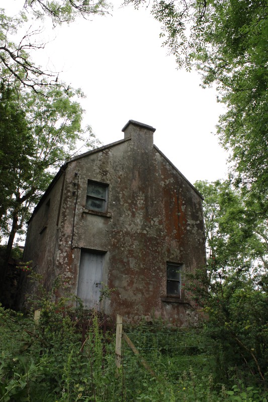
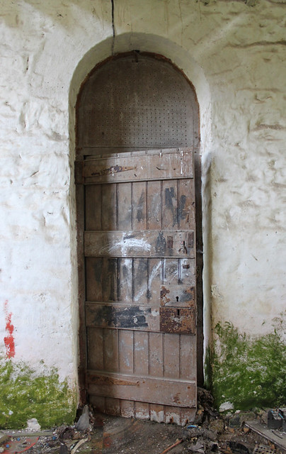
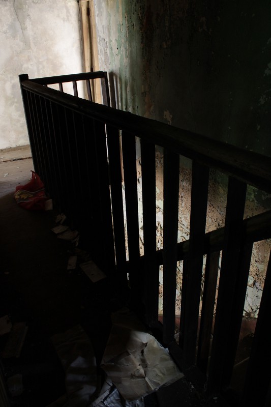
10) I have a long standing project of documenting ‘Ghost houses’, vernacular houses in Ireland left abandoned when their owners died or emigrated. The owner either had no family, or the heirs had no interest in a small old-fashioned house in the middle of nowhere.

http://farm6.static.flickr.com/5259/5402484587_9842388f8b_b.jpg

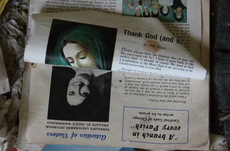
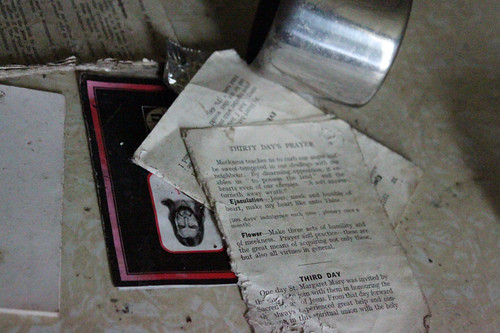
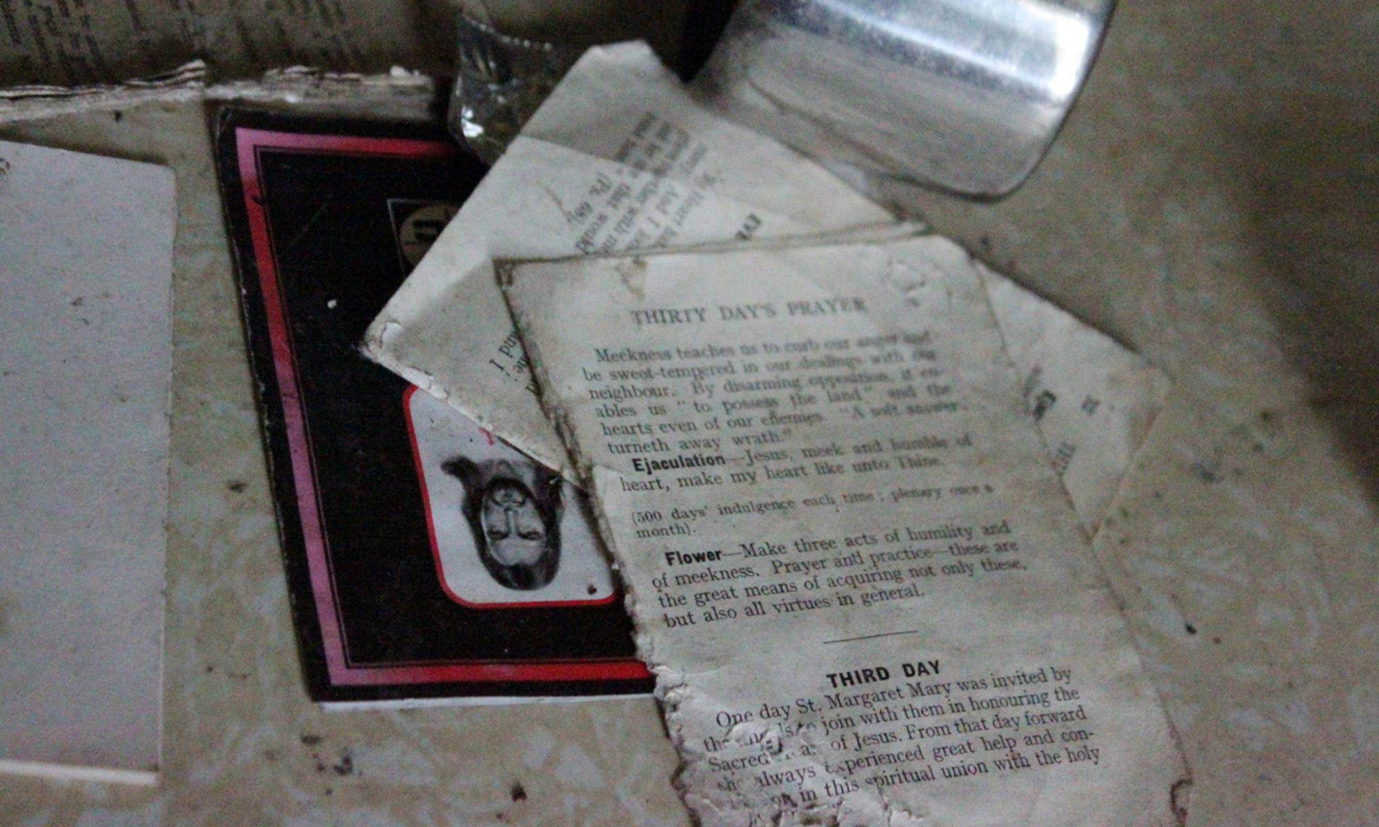
11) The ‘Ghost Houses’ interest me as social documents. The objects in them reflect the power of the Catholic Church in Ireland, and a long history of poverty and hardships.

http://farm6.static.flickr.com/5174/5403081264_8c1a461e8f_b.jpg

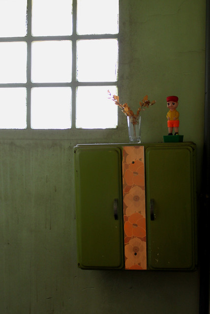
12) The Ghost Houses are also fascinating as purely aesthetic subjects. The play of light and shadows in them is often beautifully eerie and uncanny juxtaposition of objects are often to be found.

http://farm5.static.flickr.com/4020/4380795842_951bea7890.jpg

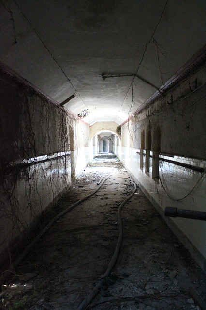
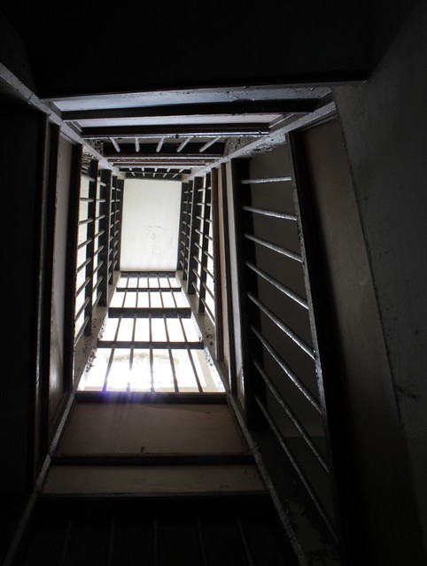
13) Michel Foucault defines ‘Disciplinary Institutions’ as places where people are made useful and obedient through the repression of any deviation from the norm. I documented such places in Ireland, where access to derelict buildings is easier.

http://farm3.static.flickr.com/2732/4386318410_00edec5993_z.jpg?zz=1

14) Magdalene laundries were used to imprison women who were judged in danger of being promiscuous, or not docile enough by their family. Many mentally disabled women were also imprisoned.

http://farm5.static.flickr.com/4005/4385382999_f603202109.jpg

15) Insane asylums had long been used to get rid of people judged eccentrics. Husbands also sent their wives there to get rid of them when divorce was not allowed.

http://farm6.static.flickr.com/5253/5403081988_a3ac7b3d88_z.jpg

16) Workhouses were used to imprisoned poor people in Ireland and the UK. They were made to work for free when they found themselves unable to earn a living (for example when they lost tenancy on their farm).

http://farm3.static.flickr.com/2761/4320279774_fde3e8da47_z.jpg?zz=1

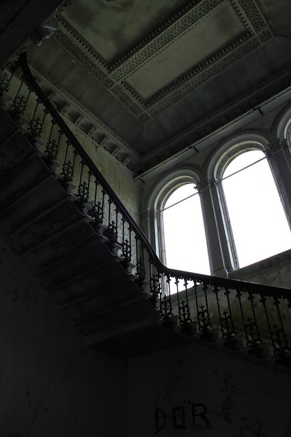
17) I photographed Woodlawn House, a derelict mansion in Ireland. In the video, I tried to replicate the formally composed long travelling shots from ‘Last year in Marienbad’ because the majestic decor reminded me of the Marienbad Palace if left abandoned.

http://farm6.static.flickr.com/5052/5403082858_ce13ae2f64_z.jpg

18) I took pictures of kitsch in my childhood village in search of uncanny juxtapositions, inspired both by the Surrealists and the photographers of backwards America.

http://farm3.static.flickr.com/2465/4040152369_c57f2436bb_z.jpg?zz=1

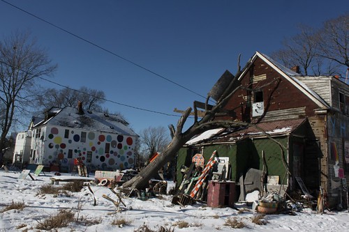
19) I took pictures of Raw Art Environment because they physically represent the way people reinvent their surroundings to match their psyche. What photographers and experimental film-maker do metaphorically in their images, marginalised Raw Artists do literally in their home.

http://farm6.static.flickr.com/5139/5403472788_fbc8a70b11.jpg

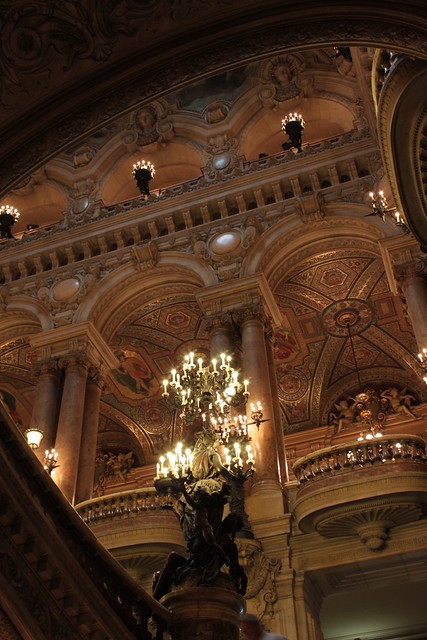
20) The last practical work I did was to take pictures and videos in the Opera Garnier in Paris to experiment with the visual possibilities offered by very ornamented décors, inspired by Alain Resnais’ film ‘Last year in Marienbad’ and Robert Polidori’s photographs of Versailles.

http://farm6.static.flickr.com/5184/5681648965_fdb41a4be7_z.jpg

Video tutorial

I’ve uploaded a video tutorial:

http://melaniemenardarts.wordpress.com/photography-and-video-practical-tutorials/

In this tutorial, I have compiled technical tips from four reference books: The art of technique: an aesthetic approach to film and video production by John S. Douglass and Glenn P. Harnden, Cinematography: Image Making for Cinematographers, Directors and Videographers by Blain Brown, The Techniques of Film Editing by Karel Reisz and Gavin Millar and Cinematic Storytelling: The 100 Most Powerful Film Conventions Every Film-maker must know by Jennifer Van Sijl. General knowledge present in any reference book is not referred to a particular book. When a book made a particular point not seen anywhere else, I point to the exact reference.

This tutorial is aimed at video artists and makers of short experimental films with a low budget and minimal crew (or working alone) therefore it focuses more on mood, atmosphere and the look of the film than on traditional narrative, and techniques involving high budget and /or large crews are not discussed (complicated lighting set ups, camera moves requiring expensive equipment and such).

I have written this tutorial mostly for myself, that’s why it is currently presented as a series of notes. I may write it down properly later if I have spare time and enough people find it useful.

I very much hope this tutorial will be useful to many people, however, it took me a lot of work to write it therefore all content is copyrighted to me. You are welcome to use the information, quote etc… but please refer to the source as:

PHOTOGRAPHY and VIDEO PRACTICAL TUTORIALS

Please give this above link, not the link of the actual document you took because the general link will always contain the latest version of the document.

Many thanks and have a good read!

Note: sound design section is currently incomplete.

‘Last Address’ by Ira Sachs

‘Last address’ is a 9 minute HD video by director Ira Sachs, cinematographer Michael Simmonds and editor Brian A. Kates showing the exterior of houses where NYC artists who died of AIDS formerly lived. The video is mostly made of carefully composed static shots, most of them bathed in an eerie light that appears to be this unique late afternoon light. This aesthetic choice contrasts interestingly with the harshness of both the subject matter and the typical NYC architecture of brick blocks of flats with external metal staircases, giving the video a haunting yet serene atmosphere.

Follow the link to watch the video.

Robert Polidori on his work

In a book surveying his career ‘Points between… up till now’, Robert Polidori discusses interesting issues in the introduction.

His interest in interiors started in 1987 when he photographed several New York flats whose owners had recently died and that had been looted. He says ‘On one hand, I came to consider the remaining objects as exteriorizing the personal identity and ideals of the dead individuals, yet on the other hand, these same objects, carefully accumulated over a lifetime, had now become a valueless heap of trace detritus for all the rest of us to wilfully discard (or vandalize). […] I perceived the rooms and their objects as some sort of sociological/psychological Rorschach test. I was convinced that there was something intrinsically historic and psychic about the subject matter that should be captured for posterity. Upon further reflection I came to regard the implications of the scene as being evocative of the human condition in general.’

In 1994, he photographed buildings destroyed by the Lebanese Civil War. An old lady guided him through ruins and asked him ‘Do you feel able to take beautiful and pretty pictures of all this?’ He places this lady’s ‘dare’ (his own word) at the heart of the controversy surrounding his work. ‘My work has often been criticized as somehow lacking integrity because I transgress ethical principles by rendering tragic or violent situations as artificially “beautiful”. This “aestheticizing” is considered to be conceptually disturbing since, some argue, it brings a viewer to an experience by which realities and their causes are ultimately trivialised and misrepresented.’ On the particular reproach that his New Orleans pictures did not capture explicitly enough the government’s failure to properly maintain the levees, he says ‘a photographer cannot, after-the-fact, visually capture the long expired preceding moments, causal links or the far remote spatial tangent of a scene.’

He states his favourite subject is ‘the psychological implications of the human habitat (the room)’ and links this to his ‘phenomenological interest in wanting to know what makes something or somebody tick’. He explains: ‘though most of my photographs are devoid of the human form, I have actively sought out rooms where the interiors were substantially and meaningfully filled with traces of human interventions. I consider these traces as being imbued with iconic references to what Carl Jung called the human psyche’s Super-Ego.How one wants to be perceived by oneself and others is infinitely more interesting to me than how one might happen to look.’

He explains that, while he had long ago abandoned the ‘intellectual notion of the existence of God’, the experience of photographing Chernobyl caused him to contemplate ‘the futility of Hope as a certainty’, and ‘the eventuality of foregoing the emotional crutch of brighter possibilities was infinitely more painful’.

About his feelings while photographing painful places, he explains ‘whenever the question comes up, I always answer that I feel nothing when I make these types of photographs. I feel before and after, but while executing them it is my belief there is only time to accurately act and react. I try to preload my emotions ahead of time but I don’t readily call upon them when I shoot. I want them to be instinctual yet non-conscious. Like surgeons in the operating room, the technical imperatives of photography demand complete mental acuity and a concentration that should not be disrupted by any background noise.’ I found this statement fascinating because it perfectly describes how I feel when I take my own photographs: you have to be completely focused on the act of seeing things, and you have to do the work not only well but quick because there is only a limited amount of time during which you can sustain the required depth of concentration.

Photographers of post Katrina New Orleans

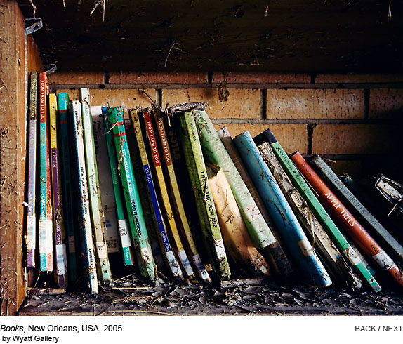
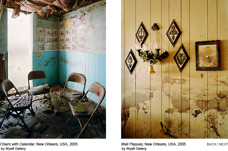
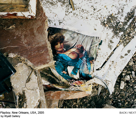
After being so fascinated by how Robert Polidori photographed ravaged interiors in his ‘After the flood’ series, I looked into other photographers of post Katrina New Orleans in order to find out how they each approached the subject, dealt with the ethical implications, and what aesthetic choices they made.

Seesaw magazine presented ‘Remnants’ by Wyatt Gallery and ‘After the Cry’ by Will Steacy.

I like the colours, depth and shadows in Wyatt Gallery’s photographs.

'Remnants' by Wyatt Gallery

http://seesawmagazine.com/photos/stegal_photos/stegalchairs.jpg

http://seesawmagazine.com/photos/stegal_photos/stegalplayboy.jpg

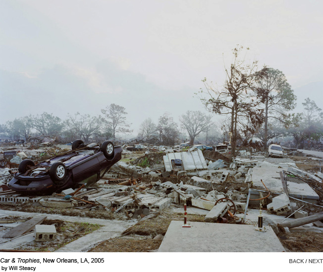
Will Steacy adopts a more documentary perspective, focusing on heaps of debris and a near scientific study of molds. He is interested in environmental concerns.

http://seesawmagazine.com/photos/stegal_photos/stegalcartrophies.jpg

In his photo essay In the Wake of Katrina, Larry Towell adopts the trademark Magnum B&W documentary style. Some pictures devoid of people have a strong haunting quality, particularly long branches and debris near the Mississippi shoreline, a stuffed fox in a glass tank escaped from a museum or collection and a flooded cemetery with the trees and tombs reflected in the water (You need to watch the whole essay on the provided link, I cannot embed particular photos from a flash presentation).

In In Katrina’s Wake: Portraits of Loss from an Unnatural Disaster, Chris Jordan mostly adopt a documentary ‘outdoor’ perspective but a few pictures convey a more aesthecized and disturbing perspective.

http://www.chrisjordan.com/img/gallery/katrina/reddoor.jpg

I found this ‘Baptist Church, Lower Ninth Ward’ particularly amazing.

http://www.chrisjordan.com/img/gallery/katrina/church2.jpg

Jane Fulton Alt is both a photographer and a social worker. Her photograph series ‘Look and leave’ was taken while she accompanied displaced Lower ninth Ward residents revisit the ruins of their former home as a volunteer worker on the ‘Look and leave’ program. The photographs are accompanied by narrative about the reactions of the people who visited their destroyed homes, but these people do not appear on the photographs. Only empty homes and personal belongings are shown. She comments ‘As a photographer, I prefer to let pictures speak for themselves. But as a social worker, I know that there are some images that stories can illuminate.’ She makes a point that the pictures were not taken while the residents visited their destroyed homes, but on her own after her social worker shift has ended. It is interesting how her perspective as a social worker influence her vision as a photographer, yet the two activities are kept formally distinct. (Again follow the link, the pictures don’t embed.)

John Woodin was raised in New Orleans. A year before Katrina, he photographed his childhood neighborhood and the interior of the homes of his family, focusing on the architecture of the ‘working poor’. After Katrina, he came back and took pictures of the exact same locations. (follow link for portfolios ‘City of memory’ and ‘After the flood’, I cannot embed pictures from a flash presentation.)

In ‘Color of Loss’, Dan Burholder uses HDR (High Dynamic Range) to picture interiors devastated by Katrina in great details despite the darkness. The photographs are supposed to look like paintings. However I find them rather disappointing because I feel the HDR process is taken too far. Moderate HDR enhancement can look striking, but here, the shadows are completely obliterated and most pictures have a completely even lightness on their full surface. To me, the colours appear both saturated and washed out because of this even bright quality to them. The total absence of shadows combined with a choice of lens giving a distorted perspective in some of the pictures cause the feeling of a total loss of the sense of space, at least to me as a viewer. It is possible that the HDR process was taken a bit too far due to over enthusiasm for a back then new technique.

Portrait of Neglect by Debbie Fleming Caffery consist in B&W photographs of displaced residents and ravaged places. There is a striking picture of plaster hands from a statue in front of a wall with peeling pain, but again, I can’t embed from a flash essay.

There are more close up portraits in Debbie Fleming Caffery’s series than in any other work considered. I find it darkly ironic that the work of Robert Polidori has been attacked as immoral for being too anaesthetized, and the documentary work of other people, for example Alec Soth, is sometimes judged dubious for having a too ‘poetic’ perspective. Documentary photography is never neutral, it always shows as much the photographer’s perspective as the events depicted, and it is even clearer when comparing the work of several photographers on a same subject.

As a viewer, Debbie Fleming Caffery’s close up portraits are the only Katrina pictures that made me feel uneasy. Though I’ve never done portraits myself, I’m always fascinated with portraits where the subject is given the opportunity to try and show themselves as they wish to be seen, such as Diane Arbus. Of course, they most of the time will project a different image as intended, or let something slip, but that’s the interest of it, the subject cannot fully control the photograph any more than they can fully control their life, any more than the photographer themselves can fully control the picture they’re taking. But at least the subject is given an opportunity, they’re given power, and the photographer takes some kind of risk than their subject may subvert the picture. I find it exciting that, because there are different inputs to the picture, the result is uncertain. With ‘candid’ portraits showing expressions with a lot of pathos, I don’t think I’m so much made uneasy by looking at people suffering, than by being presented with a picture carrying a label of ‘raw emotion’. It’s almost like the picture carries a label ‘this a truth! this person is not performing for the camera!’. But I only see the finished picture, I cannot see how it was taken, and it is still possible that the subject performs. It’s only my subjective experience as a viewer, but I think what makes me most uneasy with ‘candid’ pictures, is that they give me the impression that the photographer is denying presenting a viewpoint.

Seesaw Photography magazine

I found an interesting online photography magazine Seesaw magazine created by Aaron Schuman, Photographer and researcher at Brighton University. It contained more information on my favourite photographers and interesting new projects.

Alec Soth describes his Sleeping by the Mississipi series and his work in general as ‘more lyrical than documentary’ and reflects of the difficulty to tell a story with pictures. The iconic pictures from the series were taken in the Midwest, which is a kind of a photographic black hole, with most photographers attracter to the mythical West of the exotic and eccentric Deep South. The whole interview centers around the theme of making pictures that are somehow between documentary and poetry, ‘objective’ yet infused with the photographer’s vision and empathy.

http://seesawmagazine.com/photos/soth_photos/soth_images.jpg

Stephen Shore recently published an extended edition of his famous series ‘Uncommon Places’. It includes more portraits and interiors, whereas the original series became iconic for its images of suburban landscape and intersections. He explains how the use of large format came to him gradually while working, and how it ended up making him look into different aesthetic choices, such as abandoning the hand held in favour of a tripod to give the pictures a richness of details that forced to viewer to really stop and look. He also discuss two interesting problems: how photography that is contemporary when made may be seen as ‘nostalgic’ or ‘retro’ by viewers a few decades later, and the depth of understanding of the sense of place a photographer has for places he is familiar with, compared to a place where he’s just moved to (something he experienced after moving from NY to Monana, where he felt his pictures could only be picturesque calendar pictures at first.)

http://seesawmagazine.com/photos/shore_photos/shore_photos.jpg

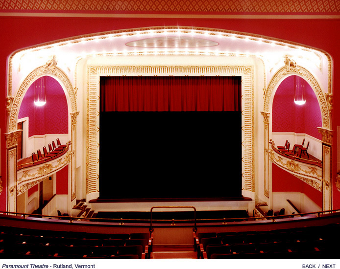
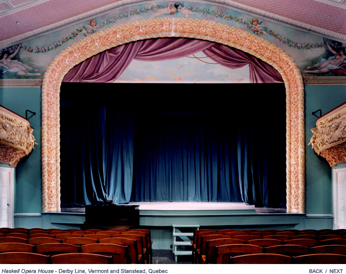
In The Stage: Raw theatres Colin Miller photographs empty theatre stages, aiming the capture the feeling of charged energy on the verge of explosion that permeates them before a performance.

http://seesawmagazine.com/photos/stage_photos/stage_paramount.jpg

http://seesawmagazine.com/photos/stage_photos/stage_haskell.jpg

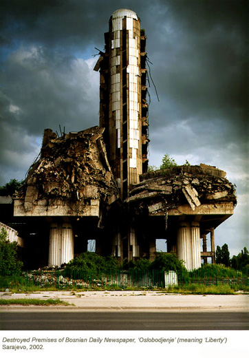
In The Balkans: architecture wounded Richard Mosse photographs post-was Balkans, including derelict buildings.

http://seesawmagazine.com/photos/balkans_photos/balkans_newspaper_thumb.jpg

Unit 1 Assessment

Develop your project proposal to plan a challenging and self-directed programme of study

The evolution of my project proposal can be tracked through the successive drafts. At first, my project was heavily influenced by Surrealism because I share their interests in psychoanalysis, psychogeography and the use of intuitive creative processes. I had however a nagging concern about merely emulating a past artistic movement.

After researching in depth the Surrealist theory of art, mainly through the writings of Andre Breton but also through other historical surrealist writings and contemporary critical texts, I understood that Surrealism was interested in finding the point of reconciliation where reality and dream merge, which they call ‘Surreality’, whereas I was more interested in pointing out ambiguous areas where dream and reality are still distinct but not easily distinguished, which creates doubt and confusion. I still felt close however to photographers who inspired the Surrealists or worked loosely with them without fully adhering to Surrealist theroy, such as Eugène Atget or Brassaï, because their photographs of cities had this aura of disquieting banality. Through this I identified Freud’s concept of the Uncanny as a key concern.

Having identified my interest in ambiguity in photographs, I researched how the same feeling could be achieved in moving image. I researched how to use sound design and camera placement and editing in a moving image work to cause feelings of doubt and confusion in the audience. These posts would later inspire the research paper.

Having identified this aim of using an artwork to manipulate the audience’s feelings, a core strand of my research now concerned the relationship between the artist and the audience via the artwork as a communication medium. For the Mid-Point Review, I devised an experiment where I showed videos to my classmates and asked them to tell me honestly what intuitive reactions they got from it, and whether those reactions differed from their ‘intellectual’ reactions as an art student. My wish to touch the audience on an intuitive level comes from 2 grounds: 1) make art that can be enjoyed by an audience without a formal education or critical references 2) take these viewers that have those critical references outside of their comfort zone, that is the ‘safe area’ of detached intellectual analysis.

I used my classmates’ feedback to determine in what measure I had achieved my aim, and develop a program of study to improve the weak points accordingly.

The first main area of improvement was to research in depth the technical means to cause ambiguity in moving image, where I felt I was not achieving my goal as successfully as in my photographs. This strand of work was mostly conducted through research about filmmaking techniques that culminated in the research paper. Writing this paper improved my understanding of moving image greatly and I learned many techniques that I plan to use in my own practical work through Unit 2.

The second main area of improvement was to research in depth the critical and theoretical aspects of audience response. I was particularly interested in Nicolas Bourriaud’s Relational Aesthetics because he focuses on the relationship/communication between the artist and their audience via the artwork and makes central the question of the social function of art and its philosophical implications, something that I feel is too often overlooked in contemporary art. The other key influence was Roland Barthes’ concept of ‘punctum’ explained in ‘Camera Lucida’. The ‘punctum’ is the little element in a picture that gives it ambiguity and different level of meanings, which is exactly what I aim to put in my artworks to be able to consider them successful.

My interest in ambiguity also led me to research critical articles discussing documentary, fiction and the sometimes blurred line between them in artworks.

The whole of the different strands of my theoretical research can be found under reading notes.

Demonstrate a critical engagement with practice-based research and contribute actively to debate and discussion

Researching the critical and theoretical aspects of audience response made me more aware of the implications of producing visual/physical artworks designed to communicate ideas and concepts to an audience.

Having identified lens-based images creating an awkward feeling of ambiguity regarding their documentary or staged nature as a key concern in my practice, I attended Canterbury University Symposium “Video art: between documentary and fiction”. This seminar made me discover artists sharing my interests within the visual arts/experimental film making fields, such as Sarah Turner and Jeremy Millar and I took the opportunity to ask them questions. Their answers to my and other audience members’ questions are reported on my blog. Previously, my moving image references were all from cinema (David Lynch, Andrei Tarkovsky).

I am active in the chat sessions debates and also aim to assist fellow students by giving them references that I feel are potentially related to their projects. For example, I recommended the book Autobiography: Artworks to Maya (via email), the artist Shirin Neshat to Tahira (during chat session), Deleuze’s Cinema 1 and 2 to Matt during his MPR because he was interested in the frame and discussed the issue of political art related to David’s project on climate change during his MPR.

I regularly submit my photography and video work made for the MA to exhibitions outside of the university, in order to evaluate their impact in front of a ‘real’ audience and find out whether professional curators find them relevant or not. I find it useful to have a neutral source of feedback from professionals who do no know me personally.

Articulate a clear understanding of the methodology and context of your creative practice in both written and verbal forms

Because I work intuitively, a whole strand of research was about analysing what draws me to the work of artists I find inspiring, ‘reverse engineer’ the methodology behind their work and see what parts of these methodologies apply to my own work, and what parts are different. I did this process both for photography and video art.

By looking critically at the work of photographers Lars Tunbjörk, Stephen Shore, Robert Polidori, William Eggleston and Alec Soth and analysing my reaction to them, I found out that what draws me to an unstaged photograph is a cinematic look, with dramatic lighting and almost ‘technicolor’ colours, that creates an ambiguous contrast with the unstaged nature of the scene (I only talk about unstaged photographs because those are what I make so far; what draws me to the staged photographs I like may be different.) I researched the techniques of these photographers and found out that the combined use of natural light and long exposure creates these deep saturated colours and this very specific mix of a highly detailed picture that still contains dark areas that I call a ‘cinematic look’. I was already working with natural light due to an intuitive preference for it. I studied the technical aspects of photography in order to rely less on the camera’s automatic settings, and force longer exposures allowing more depth of field in order to attain this cinematic look. I experimented with re shooting some photographs with more manual settings. The results were mixed: I got some real good images, but others need further improvement.

The video artists I felt closest too are Jane and Louise Wilson, Eija-Liisa Ahtila, and Markus Schinwald. Their work depict oppressive spaces, and often show lost, alienated characters wandering aimlessly in them. I identified this particular vision of the human condition as the key appeal of their work for me. When I wrote the research paper, I linked this feeling to the concept that the experience of the modern man is ‘labyrinthine’ developed by Nietzsche, Benjamin and Sartre, and discovered that my favourite films used cinema techniques to make the audience experience this feeling of being lost. I broke down the techniques used into categories of narrative forms, set design, choice of colours and lighting, rhythm and editing and sound design and dissected each of them. I hope to be able to use them in my own video work during Unit 2. I had made 2 videos for the MPR and while I was quite satisfied with ‘Ghost House’, I found ‘Disciplinary Institutions’ too dry and descriptive. In unit 2, I hope to be able to improve the depth of feeling created by the videos by using more sophisticated techniques.

These technical considerations can be found in the category moving image techniques. Posts leading to technical conclusions about my own practice are tagged ‘methodology’.

All the practical work done during Unit 1 is filed under my practice, which includes two main projects Disciplinary Institutions and Ghost House as well as various independant experiments.
Markus Schinwald

I realised I had no post about Austrian Video artist Markus Schinwald despite him being my very first video art influence. In 2005, I saw “Dictio Pii” (2001) at the Tate modern and I was immeditely spellbound by it. The video shows strange, stoic looking characters wandering aimlessly though a drab, dark hotel that would not look out of place in a David Lynch or Roy Andersson movie, or a Kafka novel. The characters perform odd, seemingly pointless actions and seem utterly lost in the labyrinth of the hotel. Apparently, the journey of each character is on a separate channel and the viewer is invited to switch between them with a remote. However I did not know that when I saw it at the Tate as I did not get access to the remote. I thought the switch of point of view was pre-ordained by the artist. This turned out irrelevant to my enjoyment of the piece though.

I copy here the haunting voice over monologue that accompanies the characters’s meanderings:

We are the perfume of corridors
Unfamiliarised with isolated activity
Traitors of privacy.

We are Utopian craftsmen
Scope heeled diplomats, pretty beggars
Not the product of poverty
We don’t take from anyone.

We are pillared by mild sadness and polymorphic history
Eternally skeptical,

But We Believe.

We are immortal volunteers
Living in the sensation of being everything
And the certitude of being nothing.
We are just an outline.

We disband prompted paths of movement
Extend our bodies,
Become abysmal dancers.
We are illiterate of perfection, following the curves of belief.
Interested only in the gestures of bending.
Scaffold-ed postures,
obscene geometry.
Frozen irony.

We are derranged.

Other works with the same atmosphere of claustrophobia and isolation seem to be “1st Part conditionnal” (2004) and
“Ten in Love” but I could only see excerpts from it on youtube.